Recently I launched the initial version of Pirep, a collaborative website for pilots to collect & share their local knowledge about airports such as transient parking location, crew car availability, nearby attractions/restaurants, camping information, etc. The central component of Pirep being the map page where airports are charted and filterable based on what amenities exist at them.
While it’s easy to get a map with satellite imagery, naturally one would also want the FAA VFR sectional charts as a layer on the map as well. This turned out to be fairly easy to get a proof of concept for, but much more tedious to get to a production-ready state.
If you’re looking for the final product, skip to the bottom.
As every pilot knows, the FAA publishes VFR sectional charts which divide the continental US into 37 rectangles of roughly equal size. This division being a left over from the era when pilots used paper charts for navigation. It wasn’t exactly practical to fumble through a map the size of the entire country in a small cockpit and also not cost effective to buy a new paper chart of the whole country every 56 days when most private pilots are only flying in one section of the country on a regular basis.
As such, the FAA publishes digital map files now for each of these divisions. Thankfully in a GeoTIFF format too which makes them fairly easy to work with using industry standard tools. All of the files are located on the FAA’s Digital Products website.
With that, the first step to making our map layer would be to convert one of these charts to map tiles and put it on a web-viewable map.
Enter GDAL
This entire process boils down to using GDAL utilities in the proper manner. GDAL being a open source library for manipulating geospatial data. GDAL is an incredible resource and none of this would be possible without their software.
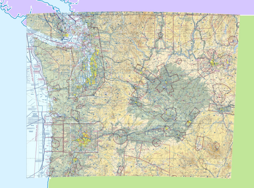
It’s mostly straightforward to convert one of the FAA’s GeoTIFF files into map tiles with GDAL’s Python script, gdal2tiles.py. For example, if you download the Seattle sectional chart from the FAA’s website, we can generate map tiles as such (for these examples I’m using the Seattle chart but the process is the same for any chart):
1
2
3
unzip Seattle.zip
gdal_translate -of vrt -expand rgba "Seattle SEC.tif" Seattle.vrt
gdal2tiles.py --zoom "0-11" --processes=`grep -c "^processor" /proc/cpuinfo` --webviewer=none Seattle.vrt tiles
Note: the --processes option is used here with the value set to the number of CPU cores on the system to speed up generation. This can be removed/modified as desired.
Second note: Everything here is written with GDAL version 3.6 or later. Some features used were added in this version. Using an older version will likely result in malformed map tiles.
In order to use gdal2tiles.py we first need to convert the GeoTIFF file into a VRT file which is where gdal_translate comes into play. From there, we can generate map tiles and display them with a web mapviewer. In this case, I opted for MapLibre, but other maps should work as well.
Looks pretty good, huh?
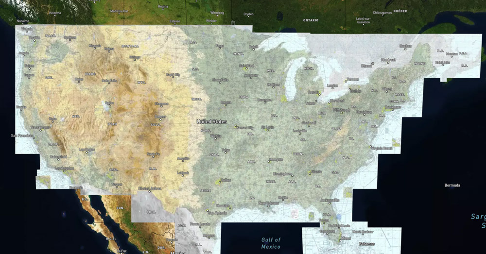
I’d say we have a decent proof of concept. We can take a GeoTIFF file from the FAA, generate map tiles, and display them in a browser. It should be straightforward to add the rest of the sectional charts to get our sea-to-shining-sea map, right? Well, things start to get more complicated from here unfortunately.
Displaying Multiple Charts
My first attempt at displaying multiple charts was to simply run the same GDAL commands as above for each chart with the same output directory. After all, map tiles are just small images with unique paths. It should be fine to build up a directory of these images through multiple passes, right? To a point that works, but the main problem comes with the boundaries between charts. Since there will be some overlap between the tiles neighboring charts would overwrite each other creating gaps in the final map. That’s no good.
Instead, most web map viewers support the concept of multiple layers. So we could generate map tiles for each chart in its own directory, add each one as a layer on the map, and call it a day. This works to an extent but has two significant problems:
- Performance. Creating a map layer for each chart was my second attempt at solving this and while it worked decently from a visual perspective, my experience was the map viewer I was using, Mapbox, started running into significant performance issues when you put 40+ map tile layers on the page. This worked, okay-ish, but the initial page load time could be upwards of 10 seconds which was unacceptably slow for my purposes.
- The bigger issue, however, is the chart legends in the GeoTIFF files. If we ignore these they’ll have tiles generated for them as well and then we end up with something that looks like this:
That clearly looks awful, but these are layers after all, so why not layer them in a particular order such that the legends are overlapped by neighboring charts in the right order? Again, this kind of works (seeing the trend with this yet?), but the problem is that the sectional charts are not consistent with their legends and axes. You’d need to load the charts in a very particular order to get this to look right and that’s also not accounting for the odd-shaped charts too which aren’t perfect rectangles. Maybe you could get this to work, but combined with the performance issues meant that I had to look for another solution.
Chart Cropping
The solution to the problems above is two-fold:
- Crop the legends and axes out of the GeoTIFF files so we’re left with just the actual chart portion.
- Combine all of these cropped charts into one big chart and then use GDAL to generate tiles from it since it’s thankfully smart enough to handle stitching together multiple charts seamlessly where they overlap.
Cropping the charts is easier said than done, however. The charts themselves are not of standard sizes and vary with latitude. GDAL can do this cropping, but we need to give it a shapefile to crop against. And since there’s no way to programmatically do this given the variability in each chart (and why this blog post will save you a bunch of time if you’re looking to replicate this yourself), we have to manually create a shapefile for every. single. chart. Long story short, I fired up QGIS, imported the GeoTIFF charts, and manually created shapefiles for each one representing the actual chart portion. With these (linked to at the bottom), we can then tell GDAL to crop each chart accordingly before combining them into a single chart for further processing.
First though, to demonstrate let’s crop one chart and generate tiles from it:
1
2
3
4
5
6
7
8
9
10
11
12
13
14
15
16
17
18
19
20
21
22
23
unzip -o "Seattle.zip"

gdalwarp \
  -t_srs EPSG:3857 \
  -co TILED=YES \
  -dstalpha \
  -of GTiff \
  -cutline "shapefiles/Seattle.shp" \
  -crop_to_cutline \
  -wo NUM_THREADS=`grep -c "^processor" /proc/cpuinfo` \
  -multi \
  -overwrite \
  "Seattle SEC.tif" \
  "Seattle cropped.tif"

gdal_translate -of vrt -expand rgba "Seattle cropped.tif" "Seattle.vrt"

gdal2tiles.py \
  --zoom "0-11" \
  --processes=`grep -c "^processor" /proc/cpuinfo` \
  --webviewer=none \
  "Seattle.vrt" \
  tiles
Here, we’re now employing gdalwarp do some preprocessing on the chart before sending it to gdal_translate. We’re also reprojecting the chart to EPSG:3857 with the -t_srs option. This is necessary because without this when the tiles are generated they won’t be projected on the globe correctly and result in an odd looking map like this:
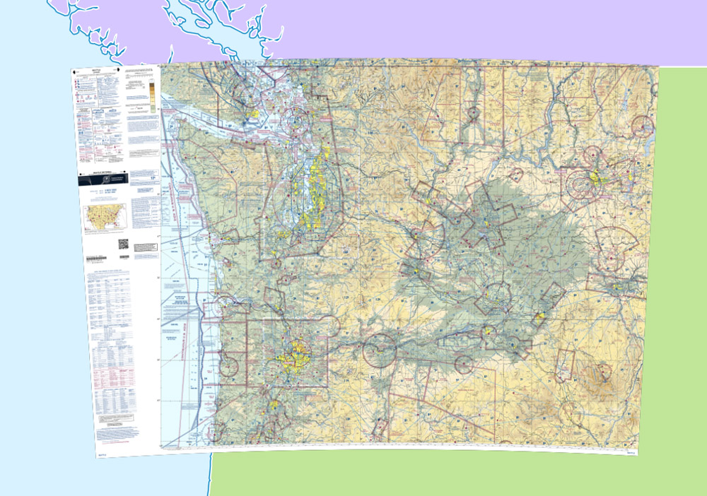
Back to the cropping, the star of this show is the -cutline and -crop_to_cutline options where we give gdalwarp our shapefile for the chart in order to get rid of the legend and axes. Everything that follows is the same as before and then we’re left with the following:
Combining Charts
Awesome, so now we’re ready to combine all of the charts into a single TIFF file and generate charts from it. This took some trial and error on my part to handle the color and alpha channels properly, but the commands below handle all of that now.
Note that generating map tiles for all sectional charts of the continental US and Alaska would take anywhere from a few minutes to a few hours depending on your computer’s resources and uses about 10gb of disk space when it’s all said and done. Because of that only four sectional charts are used here for demonstration purposes, but the process is the same for all charts.
1
2
3
4
5
6
7
8
9
10
11
12
13
14
15
16
17
18
19
20
21
22
23
24
25
26
27
28
29
30
31
32
CHARTS=("Seattle" "Klamath Falls" "Great Falls" "Salt Lake City")

rm all_charts.vrt || true
rm -rf webviewer/tiles || true

for CHART in "${CHARTS[@]}"; do
  unzip -o "$CHART.zip"

  gdalwarp \
    -t_srs EPSG:3857 \
    -co TILED=YES \
    -dstalpha \
    -of GTiff \
    -cutline "shapefiles/$CHART.shp" \
    -crop_to_cutline \
    -wo NUM_THREADS=`grep -c ^processor /proc/cpuinfo` \
    -multi \
    -overwrite \
    "$CHART SEC.tif" \
    "$CHART cropped.tif"

  gdal_translate -of vrt -expand rgba "$CHART cropped.tif" "$CHART.vrt"
done

gdalbuildvrt all_charts.vrt *.vrt

gdal2tiles.py \
  --zoom "0-11" \
  --processes=`grep -c ^processor /proc/cpuinfo` \
  --webviewer=none \
  all_charts.vrt \
  tiles
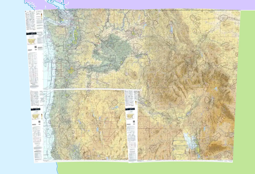
And with that, we have a nicely tiled, continuous map for multiple sectional charts:
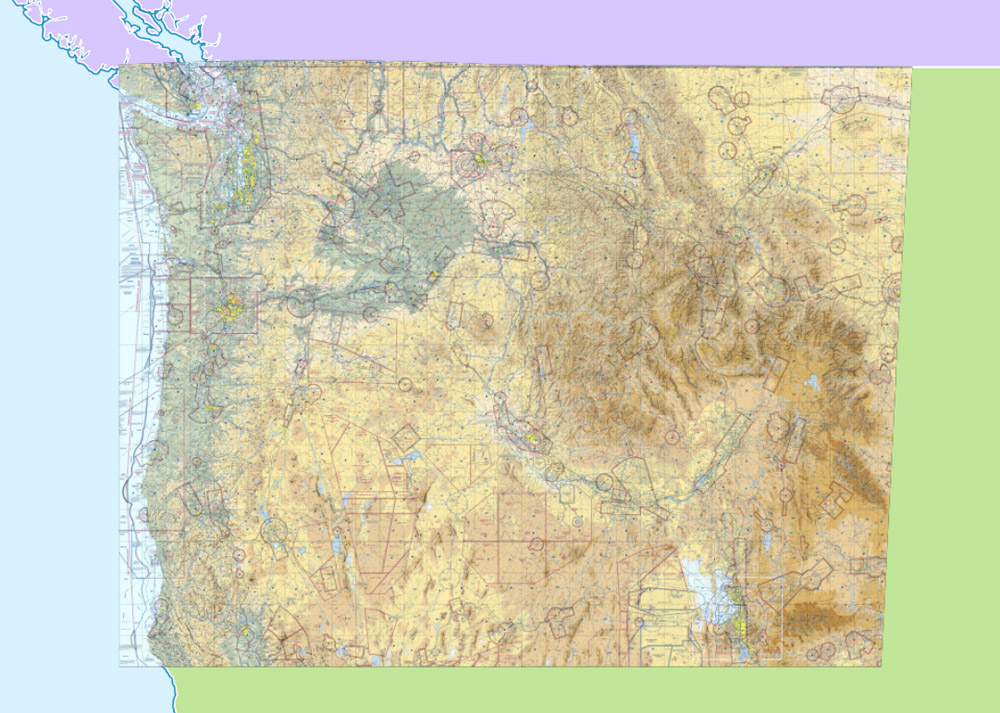
It’s not perfect; if you look closely at the boundary between two charts it’s visible where the boundary line is. However, the same artifacts can be seen on other web-viewable sectional chart websites like SkyVector so I’m fairly confident they’re using the same type of process as is done here. And frankly, this is good enough for virtually all purposes with these charts.
Maybe in the future the FAA will publish one GeoTIFF with everything already combined. That would certainly simplify this process considerably.
Tile Optimization
There are some further optimizations that we can make though. With the generation commands above, we’re left with a total directory size of just under 1gb for the four sectional charts. Each tile is on average around 100kb.
A new feature with GDAL v3.6 is the ability to use WEBP images instead of PNGs for tiles. This results in a significant reduction in image size. That’s nice for the merit of using less disk space, but the real benefit to this is that a smaller tile size means less network transfer time and a much quicker loading map. Plus, since these chart images are not especially detailed images we can turn up the compression on them without significantly affecting image quality. By doing this that 1gb total size for four charts can be reduced by a whopping 90% to right around 100mb!
Another notable option to enable is --exclude. This will tell GDAL to skip any tiles that would otherwise be empty. Even an empty image will still use a small amount of disk space and when you add all of these empty tiles up that can add up to be a significant amount. This isn’t a big deal when dealing with a continuous chart like the continental US since there would be minimal empty map tiles, but if you throw the charts for Alaska, the Caribbean, and Hawaii into the mix there’s a ton of empty space between those charts which GDAL would otherwise generate blank map tiles for.
Using both of these options, the gdal2tiles.py command reads as follows:
1
2
3
4
5
6
7
8
9
gdal2tiles.py \
  --zoom "0-11" \
  --processes=`grep -c ^processor /proc/cpuinfo` \
  --webviewer=none \
  --exclude \
  --tiledriver=WEBP \
  --webp-quality=50 \
  all_charts.vrt \
  tiles
Other Chart Types
It’s worth mentioning that the same steps for generating map tiles will apply to other chart types that the FAA publishes in a GeoTIFF format. For example, in Pirep the map has the terminal area charts available on it as well. These are generated with the same process: Crop the charts with a shapefile, combine into a single VRT file, generate map tiles. The difference being that only zoom levels 10 and 11 are generated for these charts since they only show on the map when sufficiently zoomed in. Given the physical distance between these charts, this is where the --exclude option from above makes a significant difference by skipping all of the tiles that would be empty without it.
Demo Code
To sum it all up, I put together a self-contained demo you can try locally yourself.
This archive contains a Bash script for generating map tiles, the shapefiles for cropping the charts, and a small HTML page to view the map in a browser. To use it:
- Download and extract the archive.
- Download the Seattle, Klamath Falls, Great Falls, Salt Lake City sectional charts from the FAA’s digital products page. Save these in the same directory as the extracted archive. The map tiles generation script will extract these for you.
- Run
./generate_map_tiles.sh - Run
cd webviewer && ./run_server.sh(this starts a small Python webserver) - Open
localhost:8000in your browser
Additional Resources
Everything above is a minimal demo for generating map tiles. To fully production-ize this additional configuration and logic is needed to handle all of the charts and their insets, plus all of the shapefiles for each chart. These are linked to below as well as the relevant code in Pirep for generating the map tiles.